The KaiStore team keeps up the momentum with another set of updates that make it easier to find the apps you’re looking for and enhance the UX experience as a whole.
An early verdict on discussion website Reddit: “New KaiStore update is sick!“. Here’s what’s new.
Creative animations to bridge loading time
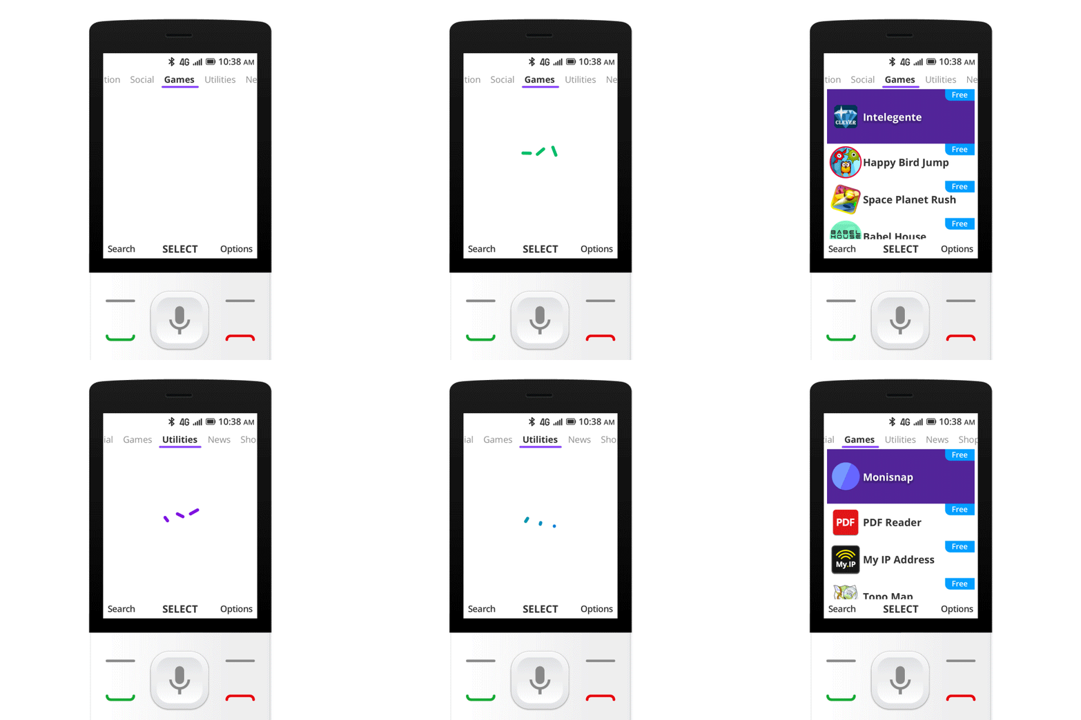
Loading doesn’t have to be boring! To keep you engaged before the content is fully loaded, we’ve created various loading animations to make them visually intrigued while waiting. There’re also new animations when scrolling down the app list and across categories, giving you a more interactive and delightful user interface. These new animations are a useful supplement to content and provide meaning to interactions that ultimately improve usability.
Seeing is believing with app screenshots
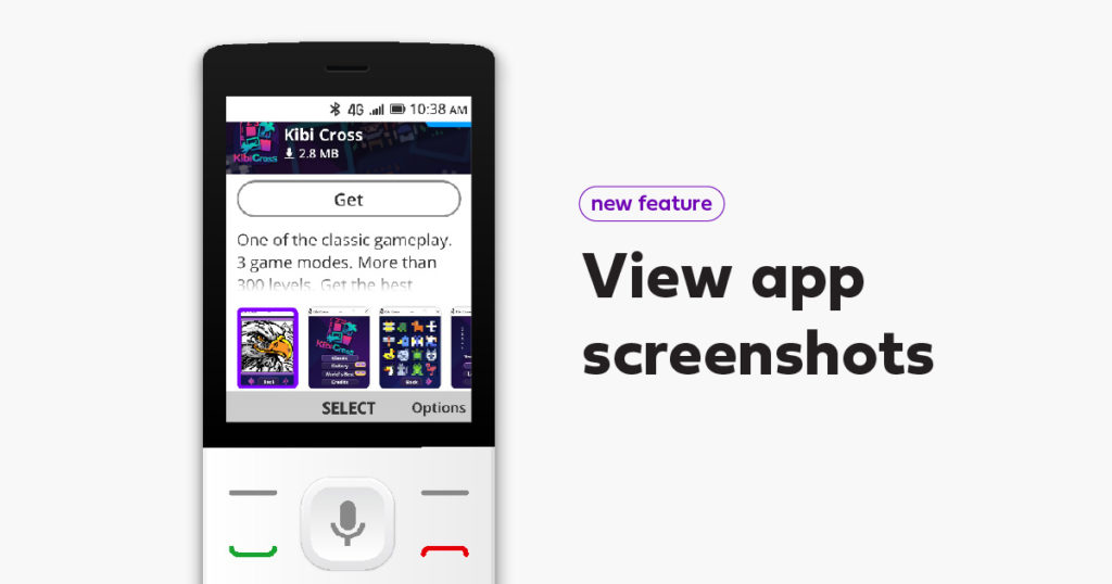
Developers can now add screenshots to their apps in the KaiStore. When you visit an app’s information page, you’ll be able to see what the experience looks like before pressing download.
We’ve also darkened the banner under the app title and description. With the added contrast, it’s now easier to read this essential information.
Get results for every search
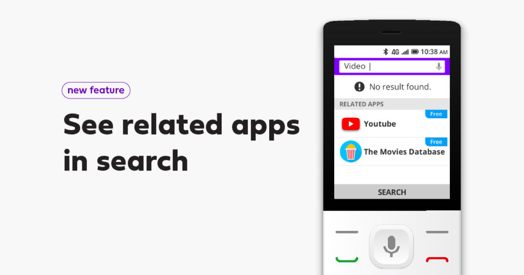
Despite our 800+ apps in the KaiStore, sometimes a search came up empty. Not anymore.
You now get suggestions related to your search if there are no results. This creates another opportunity for you to discover all the great content available in the KaiStore.
Discover even more with You May Also Like
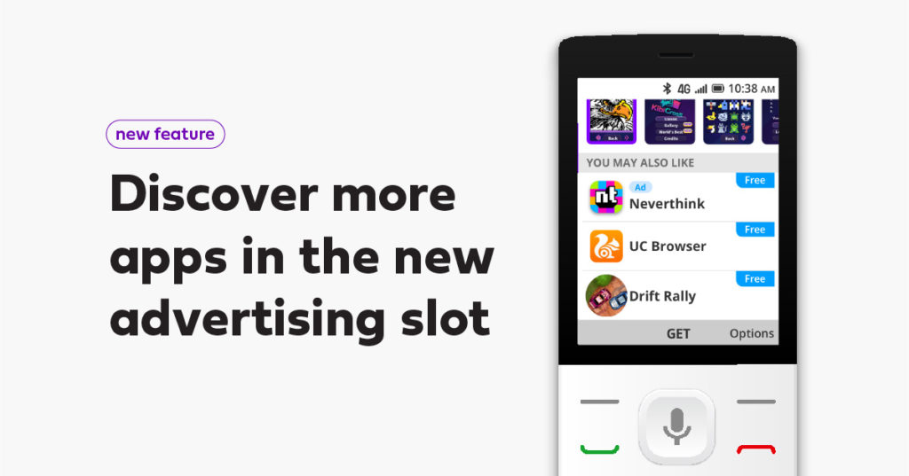
The recently launched You May Also Like page is already one of the most popular destinations of the KaiStore. To introduce you to even more great content, developers can now promote their apps using a new advertising slot* in this section of the KaiStore.
Go check out these updates for yourself in the KaiStore right now. They’re available on most KaiOS-enabled devices worldwide.
*This feature is now in closed beta and will be available to all soon. Please stay tuned!