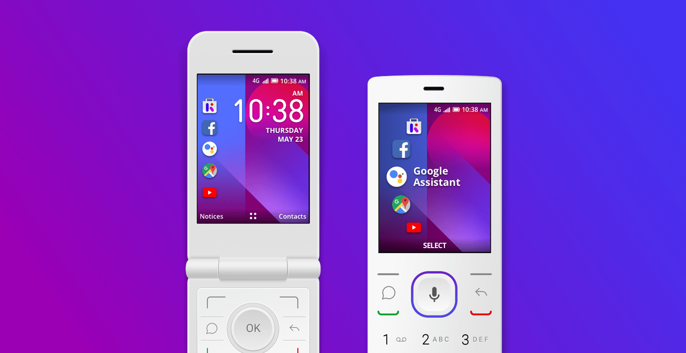
A mobile device’s interface and design greatly impact the overall user experience, and for this reason Kai strives to make improvements to our operating system at every opportunity. Take the new KaiOS-powered MTN devices for example, which feature an updated and intuitive home screen.
The updated user interface, known as a carousel design, showcases key applications on the home screen including Google Search, Google Maps, Google Assistant, YouTube, and Facebook.
Thoughtfully designed, the keypad offers different shortcut features for a better UX experience. By pressing the left key on the D-pad, the side menu will appear with the carousel design. This shortcut previews preloaded applications, which can be toggled through by pressing the Up and Down keys. By using subtle transitions such as this, the user’s experience is streamlined for efficiency.
The purpose of this update is to make it easier for users to navigate the home screen, and find the apps and utilities they use most frequently.
Our goal is to make smart feature phones with 3G/4G LTE capability, comprehensive interfaces, and rich user experiences accessible for everyone. With this latest update, we’re demonstrating our commitment to fine tuning the KaiOS experience at each step along the way.
How can we improve further?
At KaiOS we’re constantly developing best practices and products that meet the demands of our users, and to do that, we need your feedback. We’d love to hear from you and get your thoughts on KaiOS, its features, and core functionality, so visit us at @
KaiOSTech on Twitter.


